Background
To support broader business goals, WealthKernel looked to improve the navigation and implementation process of their digital presence. With user research I redesigned WealthKernel's information architecture, creating a more intuitive and user-friendly structure for their API documentation and website.
Problem
Navigational confusion and layout challenges
There were two main areas to this brief:
First, WealthKernel's product team suspected that the existing information architecture of the API documentation was confusing users, making it difficult for business and tech stakeholders to find the necessary resources. They needed a clearer, more intuitive structure and a considered landing page to create an ease of familiarisation with the documentation.
Simultaneously, the marketing team faced issues with an overly complex features menu and web pages that were not responsive, with layouts breaking across different screen sizes. These problems hindered both the user experience and the team’s ability to effectively showcase WealthKernel’s offering.
Research
Understanding navigation pain points
I conducted generative interviews with both existing and past users. The primary focus was to understand what interviewees used our API documentation for and any navigation challenges they experienced. Through three in-depth interviews, it became clear that users had missed information they were looking for, despite it being available on the site. Specifically, they tended to skip over contextual information located in the Guides section, heading straight to the API references instead. This highlighted a need to make it more apparent that both references and guides were linked to each API endpoint. Additionally, users didn't want to just build their product, they wanted to build it exceptionally and efficiently, asking for 'best practices' to understand how to code robustly and save time developing implementation plans.
Ideation & testing
Crafting intuitive navigation solutions
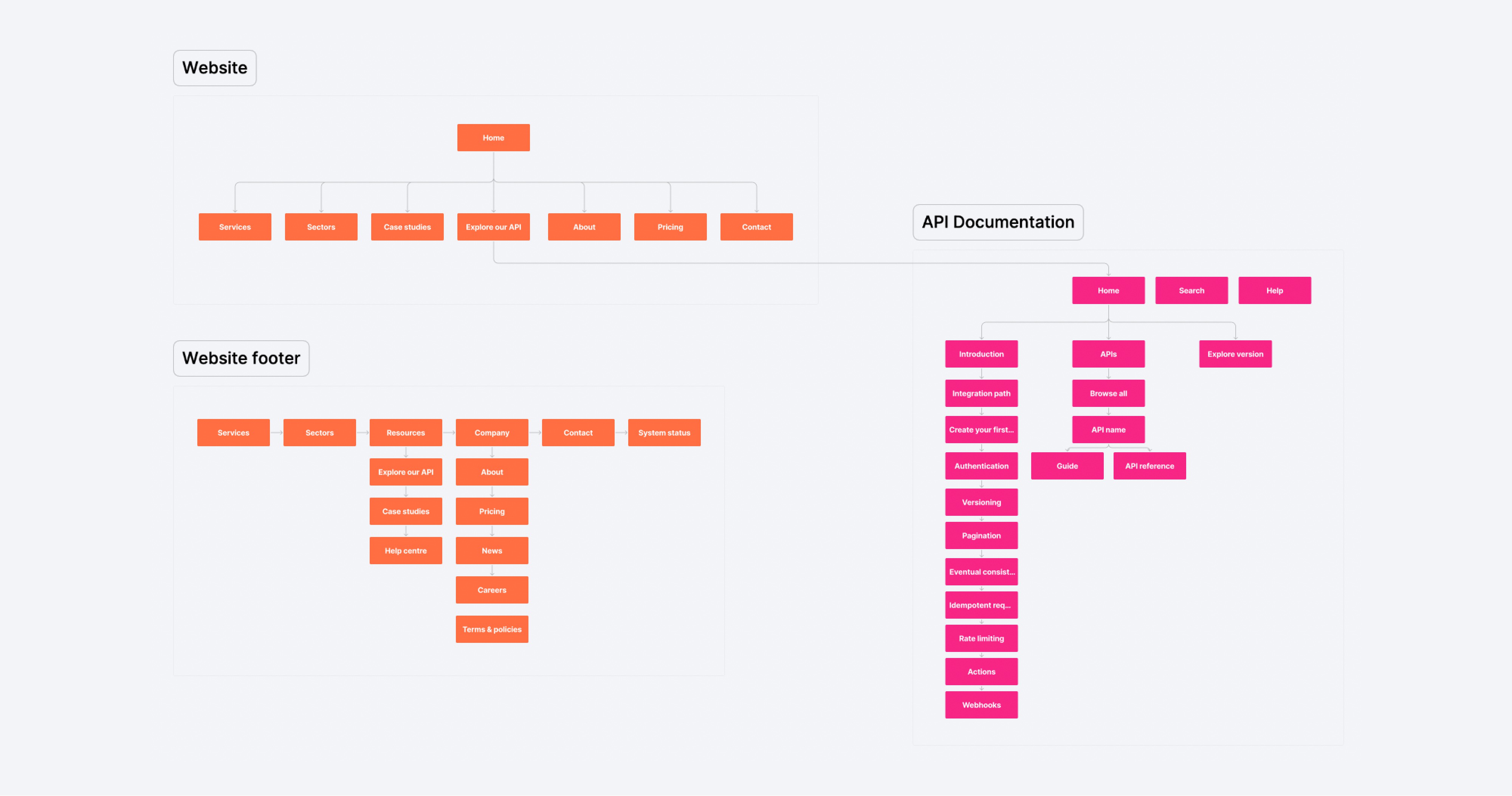
To outline a suggested sitemap for the API documentation, I began by mapping out our user groups, their needs and the relevant information required for each. This allowed me to focus when auditing the existing content on requirements and prioritise and deprioritise information accordingly.
To address the navigation challenges, I then started exploring multiple options to better connect API references with their corresponding guides. One key idea was to introduce a 'related articles' section on each API endpoint detail page, linking directly to relevant guides. However, I ultimately decided on a side navigation that grouped the guide and associated API references under each API endpoint. I felt this structure would provide users with access to contextual information without needing to dig to the next layer in the information architecture.
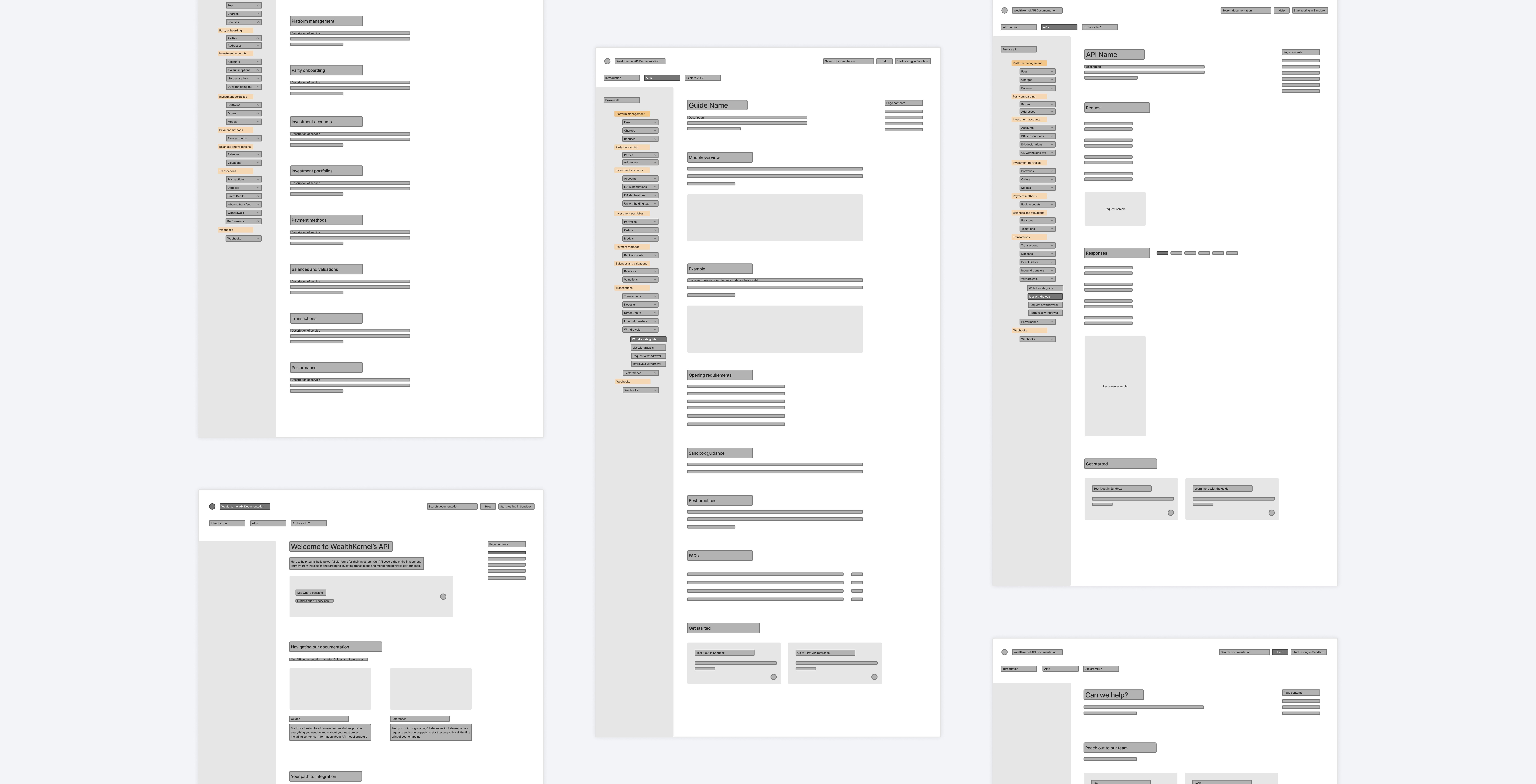
Using Figjam, I created wireframes for all the API documentation pages to get a feel for the placement of information in the context of the overall user experience. I then focused on the landing page, cross-referencing the proposed content with Stoplight's parameters to ensure compatibility.
Testing for implementation efficiency
While designing the website refresh in Webflow, I needed to consider that the marketing team, rather than a developer, would be implementing the designs and managing content moving forwards. To ensure a smooth handoff and a scalable system, I conducted tests with various plugins to identify the best tools for the team. I decided to go with the 'Figma to Webflow' plugin and create a website section template system to ensure marketing could easily manage and update the site themselves in Figma in the future.

Solution
Clear sitemap, content wireframes and landing page for API documentation
The new API navigation bars and landing page contained clear points of entry to search specific endpoints with their relative guides and references, test functionality, explore all features, and view recent updates. There was also a section for users to quickly understand how to navigate our documentation and what was available to them before entering the next level down.
By redefining the API documentation sitemap and developing content wireframes for each screen type, there were now more defined areas mapped out for users to learn about set up, build, test and debug. The content wireframes could now serve as a clear blueprint for WealthKernel teams writing and implementing future documentation.
Condensed sitemap and value-driven landing page for the website
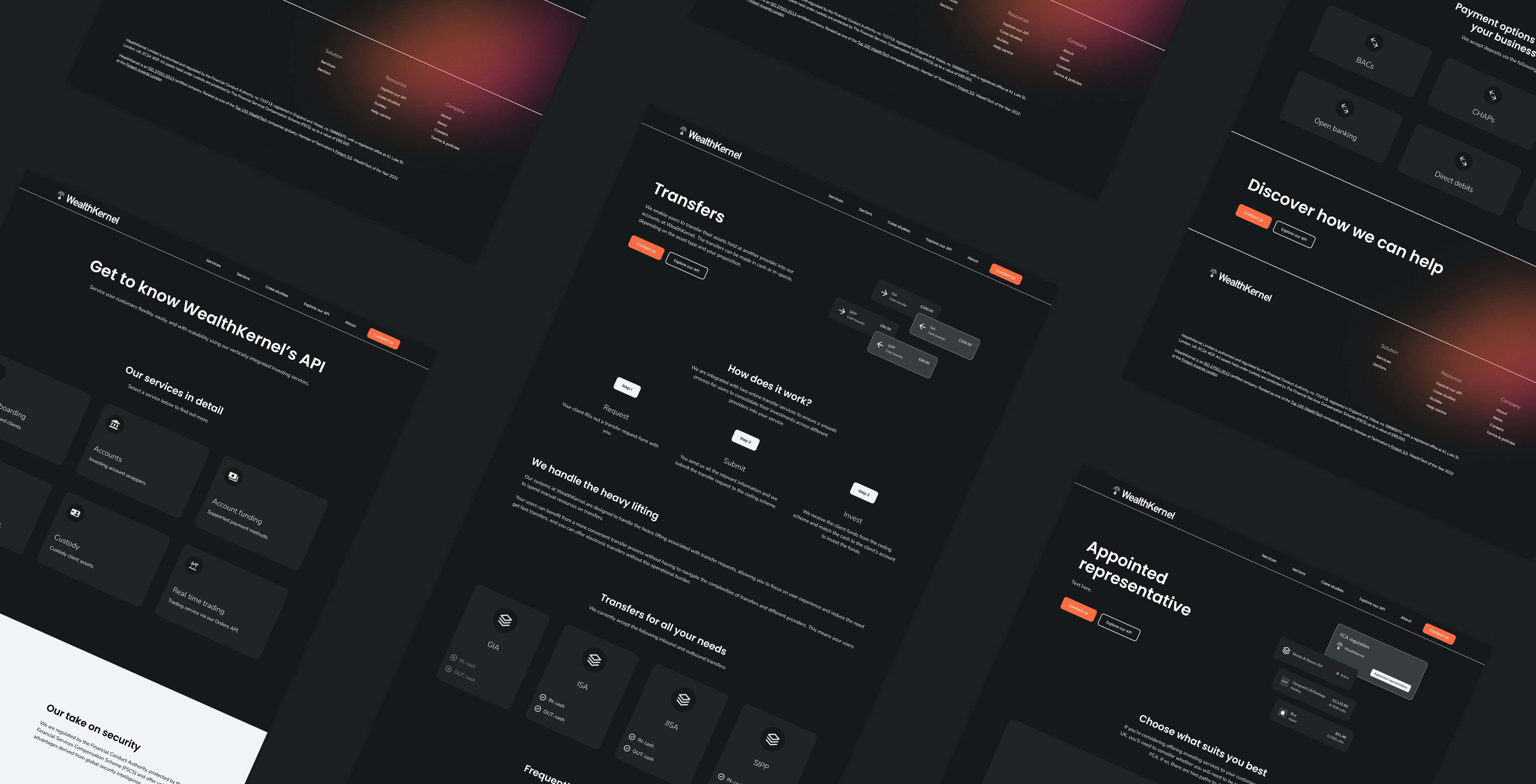
To create a more effective and user-centric website, I focused on condensing the sitemap and developing a landing page which avoided repeated content and emphasised the end value proposition over specific feature details. This shift ensured that users quickly understood the core benefits of the platform, making the website more engaging and impactful.
A modular section template system for the website
To address the marketing team’s concerns about using Webflow and responsiveness, I structured the website around section templates. This process began with a comprehensive audit of the website content, followed by wireframe sketches of all section content types. Using the Figma to Webflow plugin, I selected section templates that were automatically responsive when imported into Webflow, ensuring a smoother design process. I then styled these templates to align with our updated visual identity.
A component-based illustrative approach
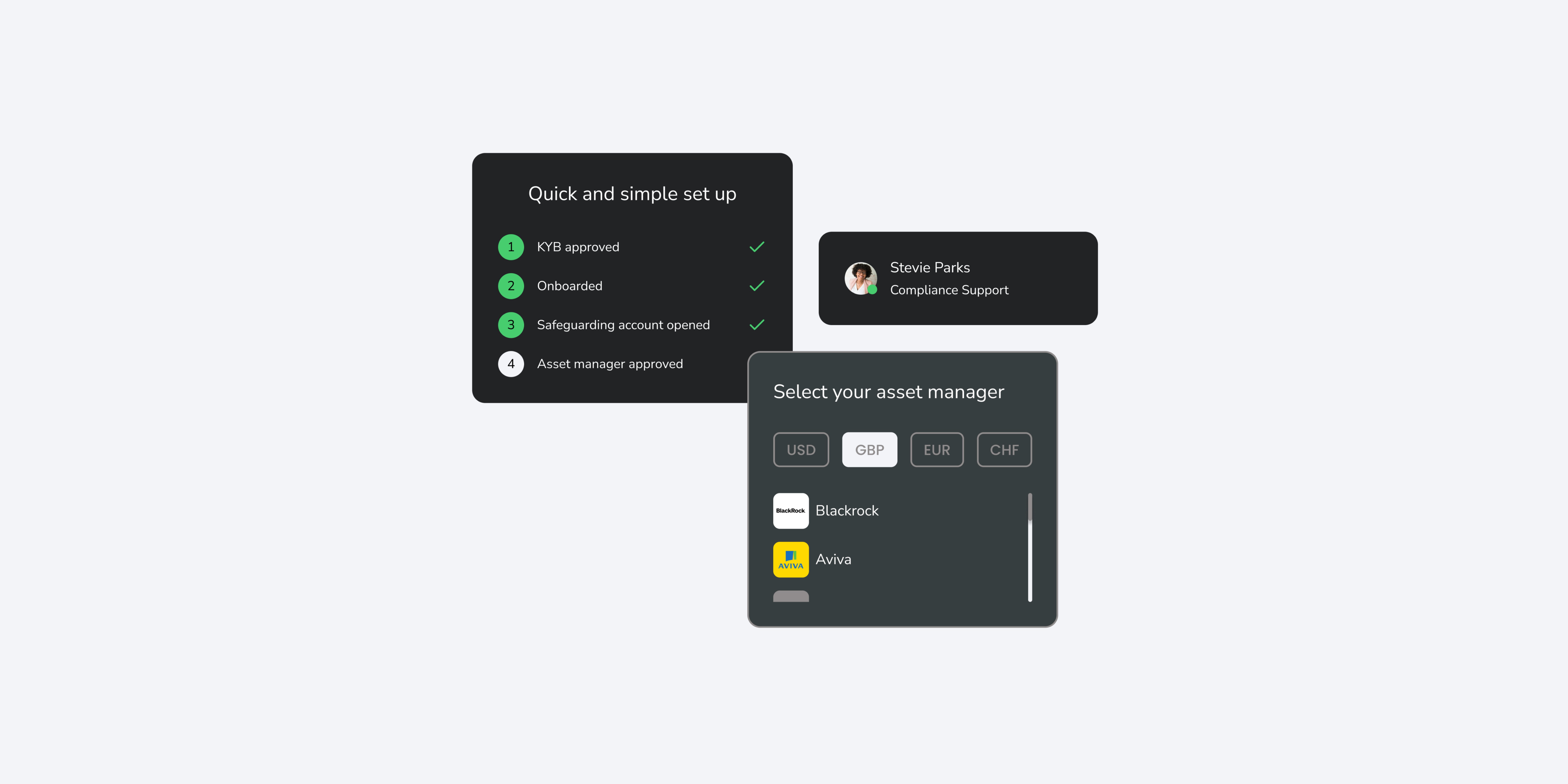
For the website, one of the key UI challenges was developing illustrations that were powerful enough to convey the API’s capabilities without being too prescriptive. We ultimately wanted users to visualise how our API could power their product. The goal was therefore to allow visitors to imagine their own products integrating seamlessly with our functionality. To achieve this, I designed a component-based, floating, and flexible illustrative style that provided visual clarity while leaving room for users’ imagination.
Next Steps
Empowering teams for future growth
The development team has been equipped with detailed wireframes for the remaining API documentation, so they can use these as a guide when writing and implementing future documentation.
Additionally, the marketing team now has a scalable template system that will allow them to efficiently build and expand future screens without needing extensive technical support. This system ensures consistency and flexibility as the website evolves.
The content in this case study is proprietary to WealthKernel. All rights reserved.