Background
In a tough fundraising environment for B2C fintechs, Nosso set out to introduce a paid tier and build our base revenue layer, whilst not sacrificing on user experience or transparency.
Problem
Scoping the subscription
There were three main areas of the brief to consider when introducing a paid tier to the Nosso app:
Deciding which features would be placed under the premium tier
Mapping out where in the flow we would introduce the paywall
Structuring the subscription model and offers
Research
Desk research: discovering the curiosity gap to approach our paywall
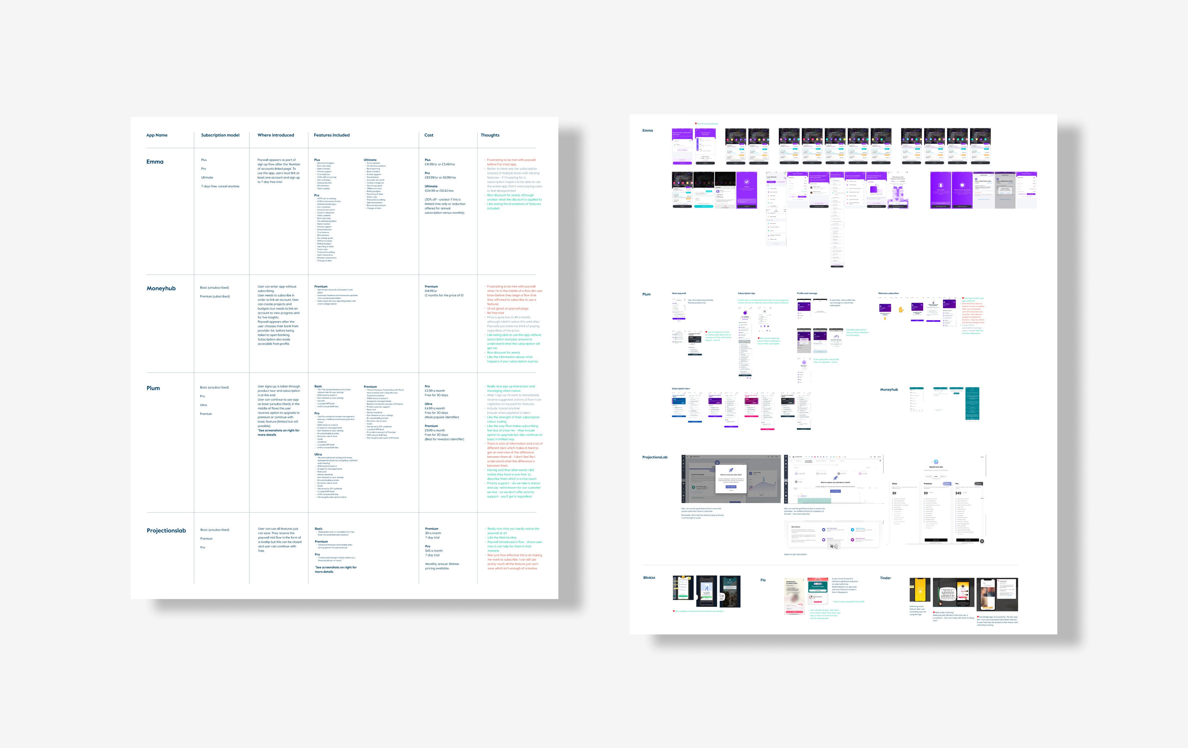
I was tasked with compiling a benchmark analysis document to show how other money management apps had structured their paid tiers. This compared the subscription models, user flows, features and cost of B2C financial planning apps and included references of interest from other industries.
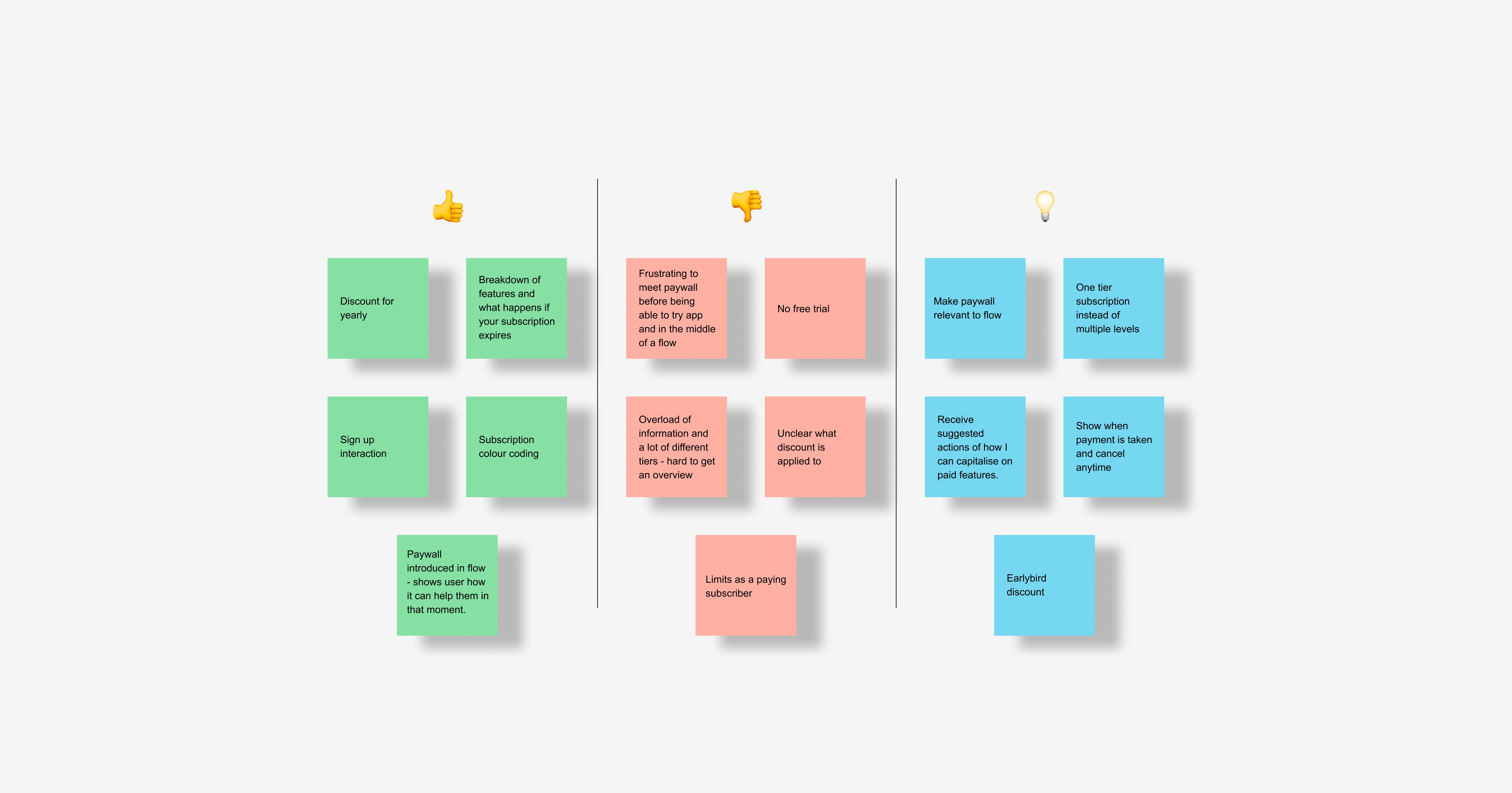
It was crucial to me to avoid dark ux and maintain a transparent and ethical user experience in this. I felt a 'curiosity gap' approach to our paywall would compliment our particular UX. Something I had learned about through Growth.Design case studies and thought was used particularly well by Tinder.
The curiosity gap was particularly good for us for a number of reasons:
We had linked data available to our users
We had recently launched goal planning
We were developing AI advice tools
Pricing that stays true to our multi-user mission
Another interesting discovery from my desk research was that other tools offering multi-user functionality based their pricing on the number of users. Therefore penalising users for adding others to their accounts. This seemed to conflict with our vision of enhancing the experience of collaborative financial planning and so I knew I didn't want to follow this pattern when crafting our pricing structure.
I also wanted to keep tiers to a minimum to avoid an information overload, sticking to simply a free and paid tier.
Ideation & testing
Presenting UX recommendations to the team
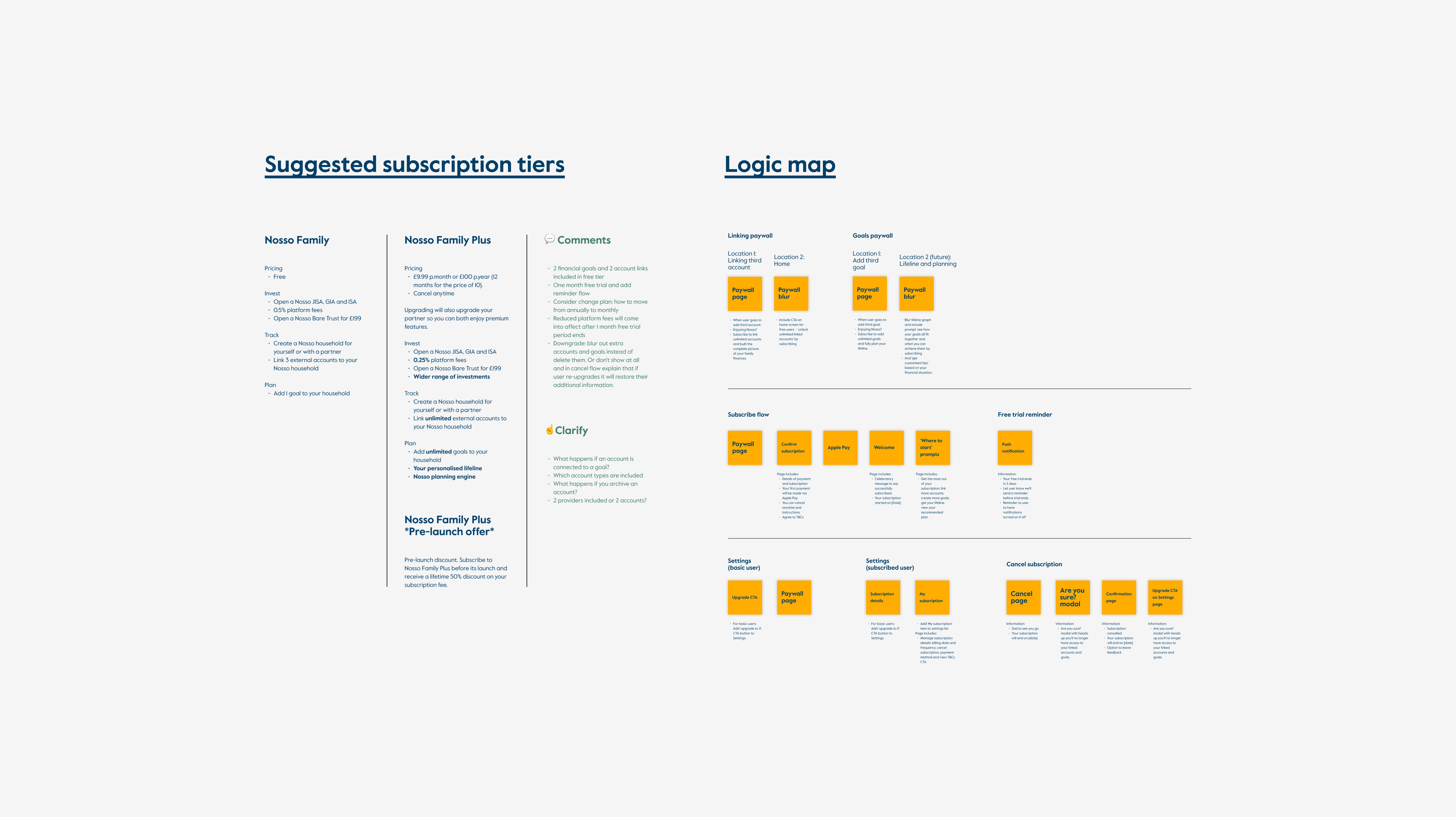
I crafted an initial presentation to the development and product teams to present the suggested subscription model. So as not to derail our early discussions, I decided not to put together the full user flow yet and instead created more of a logic map in Figma we could talk through more freely. This detailed our pricing model (two tiers and their features) and stickies for all the interactions that would be needed within the subscription experience (entry points, subscribe flow, welcome to the free trial, prompts, renewal, expiration and cancellation).
Iterating as a team
My first iteration of our tier system included a small number of account link and goals in the free tier to allow users a base level of functionality which they could then expand with a paid subscription. If one partner subscribed, this automatically upgraded their partner. Our subscription would therefore, instead of penalising multi-users, actively reward them. This was quite a significant shift away from early chats with product and so I ensured I had the research available during this workshop to support our discussion as a team.
Developing this idea further together with the team, we defined the Premium tier to include offering two account links and two goals, lower platform fees and a new feature: coaching. Users could enjoy a 30 day free trial and earlybird discount.
I translated the final scope into a roadmap on Notion to work from when beginning prototyping, this then also meant the development team knew earlier what was planned in terms of modelling and could begin building out the logic.
Mapping out all paywall entry points
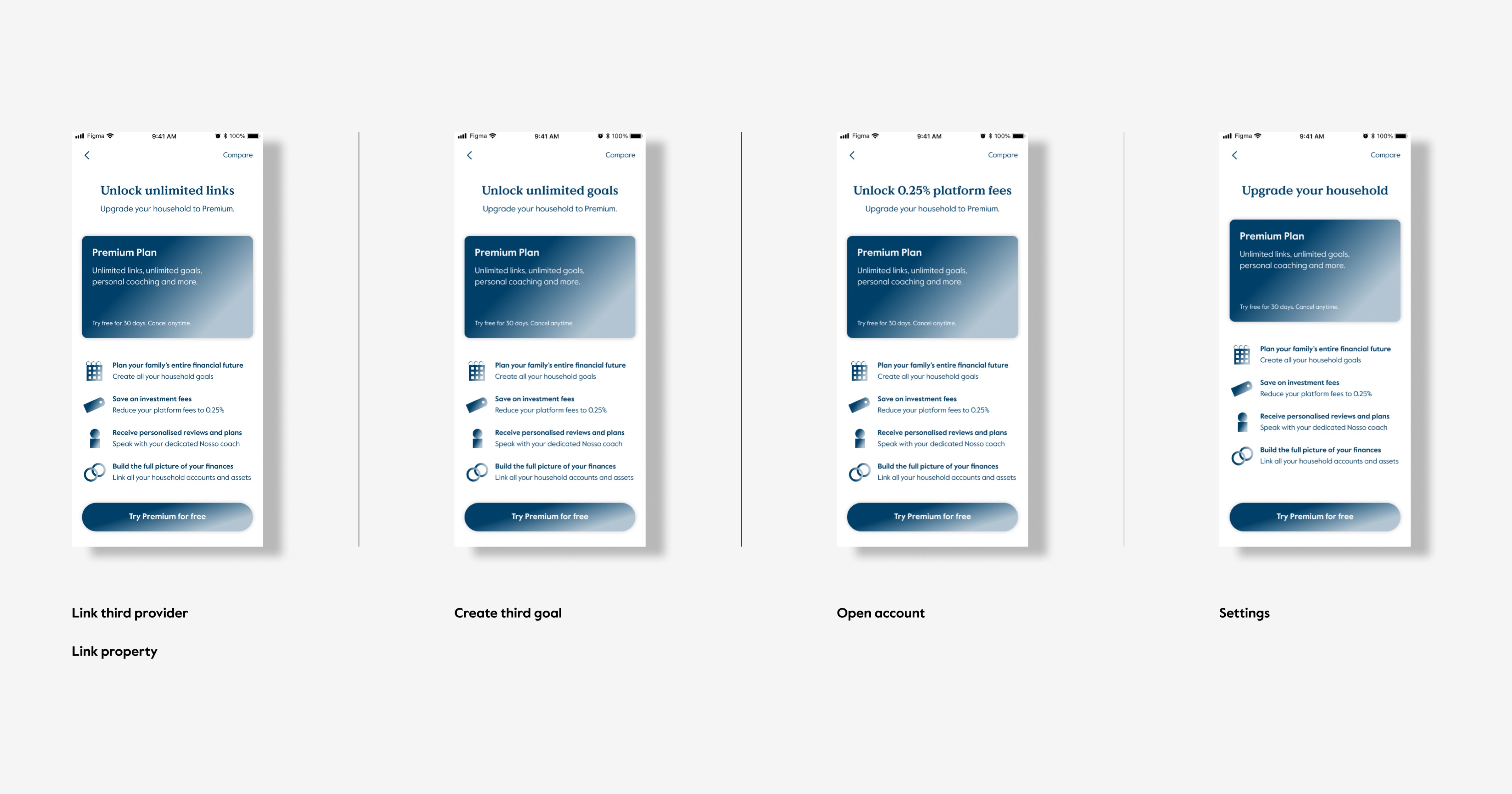
Based on the initial research, I wanted to make the paywall relevant to the user's particular entry point, to help the flow feel relevant to their desired action. I audited the app, and identified where users would open the paywall and which messaging they would see depending on their entry point.
Solution
Nosso Premium Design System
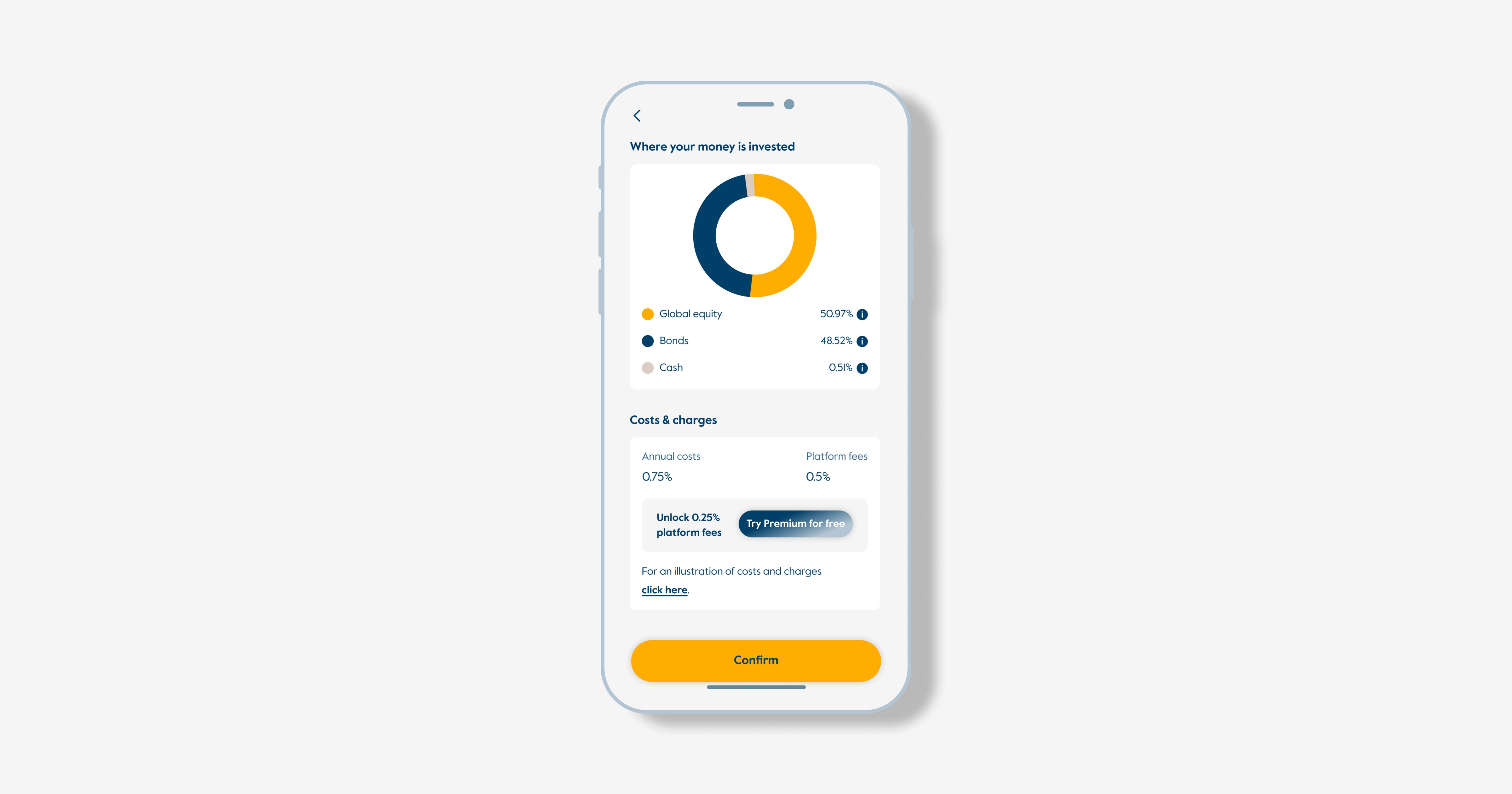
Evolution of our existing design system to integrate a Premium layer. I introduced a gradient colour style to the Nosso colour library for premium components and designed a set of UI components to highlight premium features within the app.
Prototype and Documentation
A high-fidelity prototype and documentation for the development team, covering aspects like the paywall, plan selection, comparison view, app store payment integration, welcome flow, plan switching and downgrading flows.
Naming convention
Name generation for the Starter and Premium Plans.
Coaching
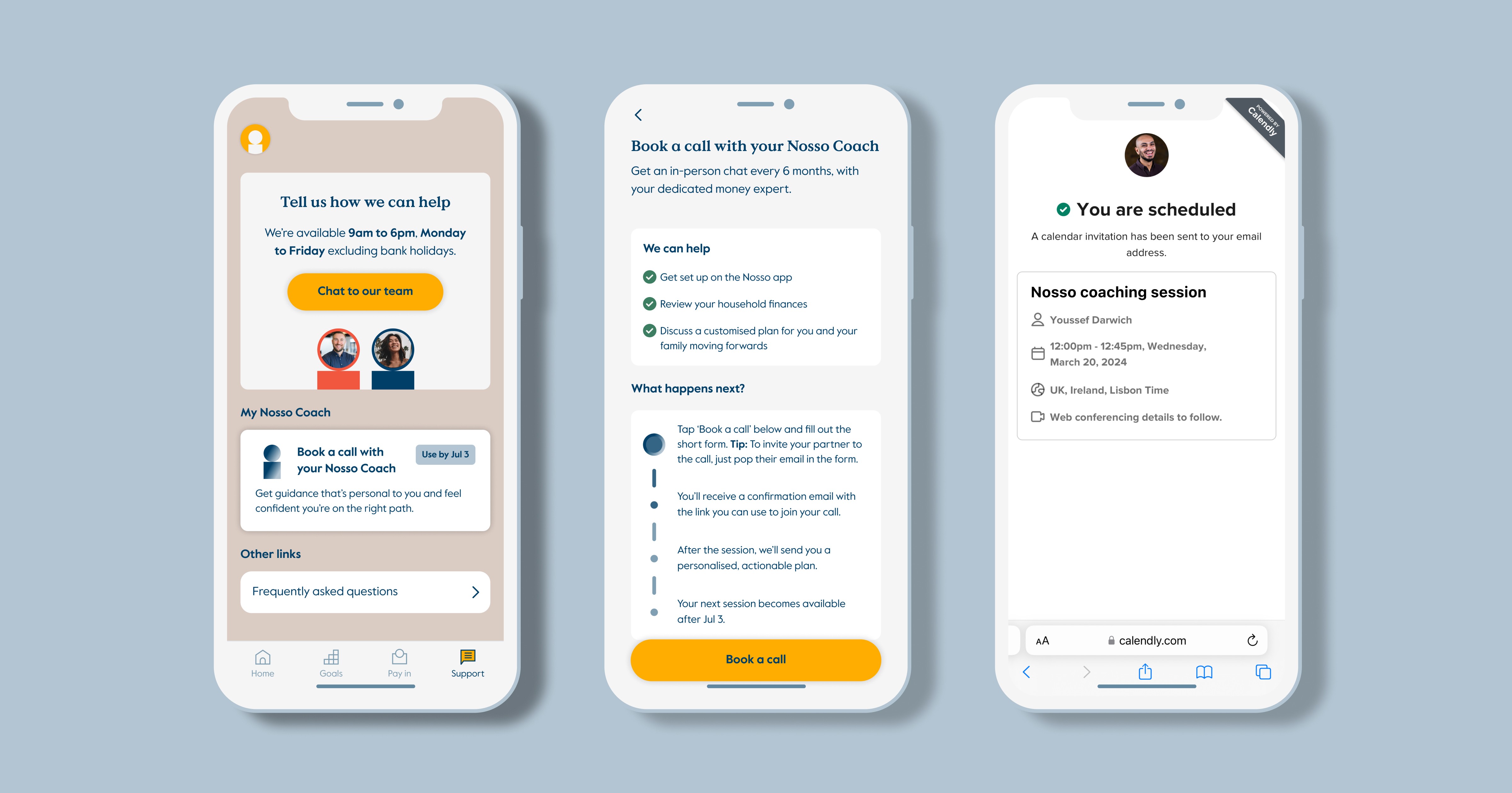
Wireframes and UI design for the MVP of a new feature we will be including in the second release of Premium tier.


Next Steps
Ensuring transparency
As next steps the plan is to also review our wider onboarding communication strategy via the App Store and website to make sure we introduce pricing early on in the process and avoid frustration later on.