Background
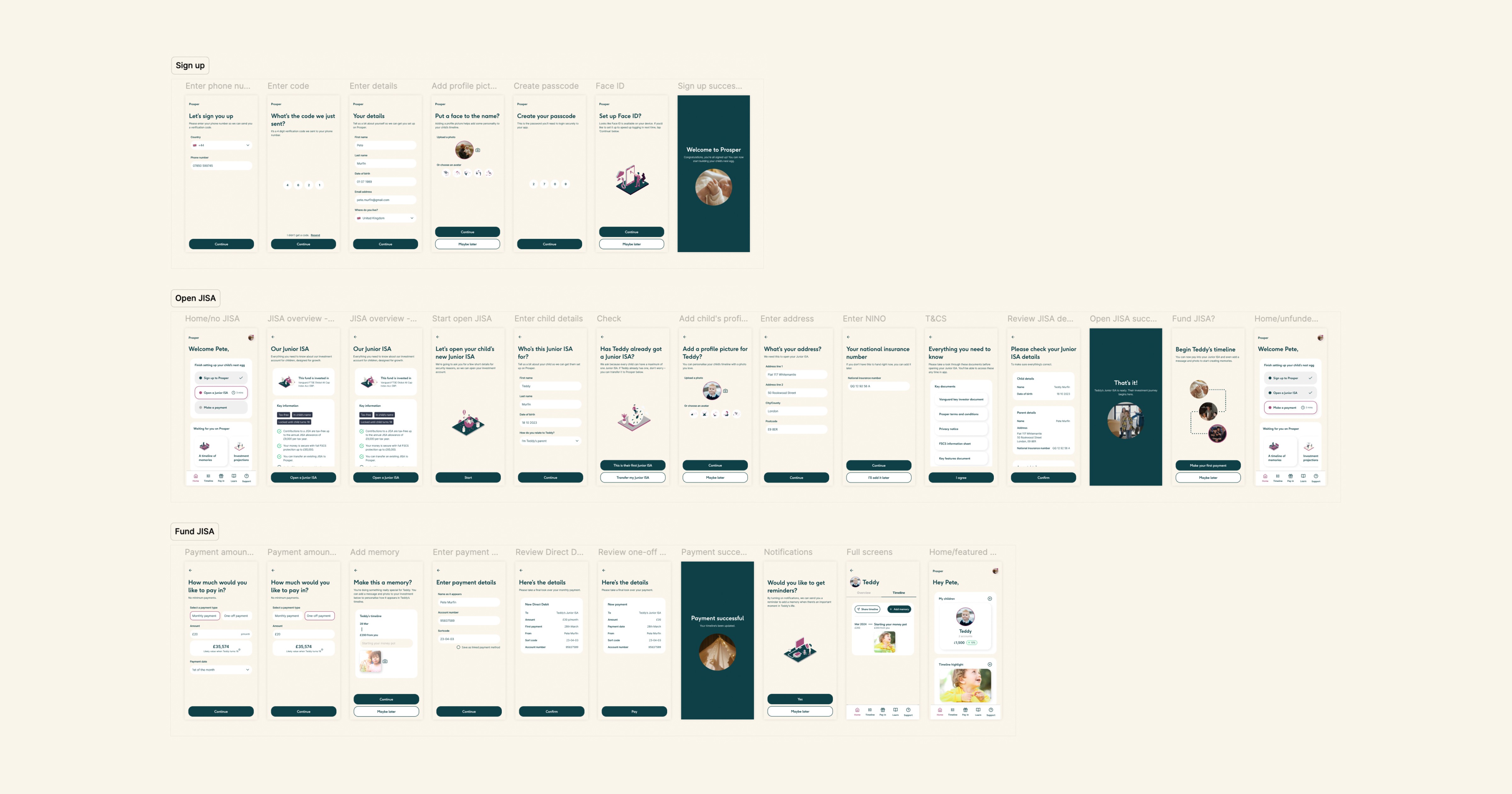
As Prosper approached a critical milestone in their growth, they needed a clear and compelling visiontype to effectively communicate their product offering. I designed their first user onboarding experience for investors to successfully open and fund a JISA.
Problem
Simplifying the onboarding experience for new JISA accounts
The challenge was to craft a comprehensive visiontype with a clear narrative that would not only showcase the platform’s value but also inspire confidence in its future potential.
The brief specifically was to design a quick and simple onboarding flow for parents looking to open and fund a Junior Individual Savings Account (JISA) for their newborn. The process needed to allow parents to easily create a Prosper account, set up the JISA, make an initial deposit, and set up a Direct Debit. I needed to set Prosper apart from other JISA providers by ensuring each step was seamlessly integrated, minimising complexity and ensuring a smooth experience for users.
Research
Understanding parent needs and testing new concepts
As Prosper was in its early growth phase, the company was actively engaged in user research and profiling to better understand its target audience. My focus was on parents, who were the primary users of the JISA feature at this stage, with the awareness that the app might eventually expand to include other family members. These parents typically had a solid grasp of financial concepts but were constrained by limited time. To differentiate Prosper from competitors like Vanguard, it was essential to identify what unique value propositions would resonate with this audience.
One aspect Prosper wanted to test with this visiontype was integrating "memories" into investments. This idea aimed to create a more personal and emotional connection to parents' investments.
Ideation & testing
Applying behavioural science
Tasked by the CEO to integrate behavioural science principles into the screen development process, I began by crafting a comprehensive process flow for the user journey. To ensure that each step of the design was grounded in these principles, I cross-checked the process flow against them. This approach aimed to foster a more effective and compelling experience.


Solution
Balancing ease of use with personalisation
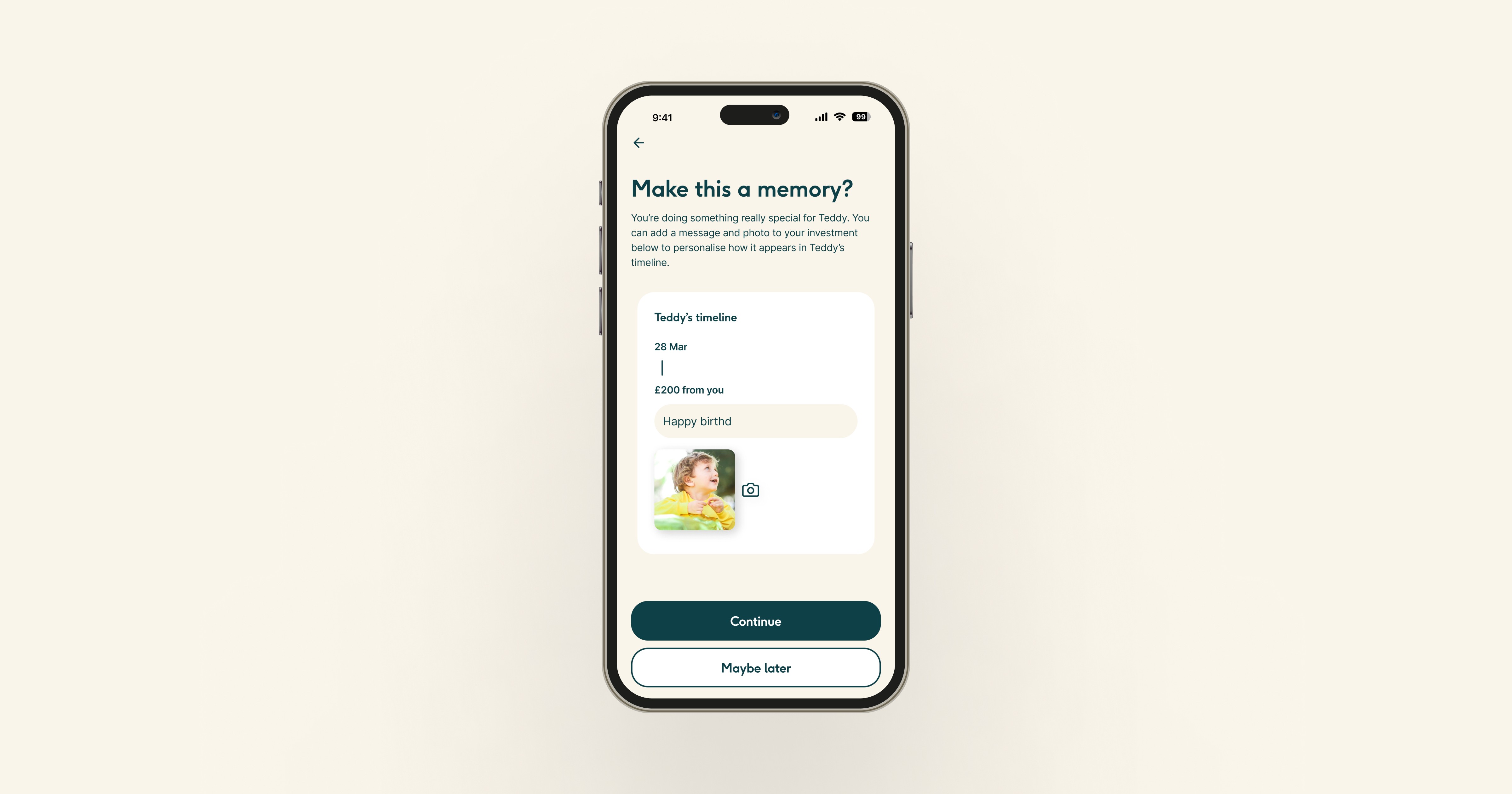
I wanted to allow for personalisation to help make Prosper JISA's feel more ownable, without introducing any friction to the experience. One key solution was the introduction of a choice when adding a profile picture for their children: photo or avatar. Additionally, I developed a timeline screen enabling users to add photos and messages to their investments. As well as a highlight reel feature showcasing collected memories over time and making the financial experience more meaningful and engaging.
Developing a resonant visual language
Building on Prosper’s existing colour scheme and typestyles, I crafted a visual language that incorporated a clear video graphic style and isometric illustrations. These design elements were carefully chosen to resonate with parents, enhancing the app’s visual appeal and usability. Impactful splash screens were created to clearly communicate the unique value propositions to both parents and families.