Background
WealthKernel aimed to broaden its reach by developing their first customer-facing platform - a portal for wealth management firms to offer to their investors. The client portal was designed to provide end users with visibility over their investments.
Problem
Bridging gaps in wealth management with a white-label solution
Wealth management firms often grapple with outdated client-facing services and reliance on spreadsheets. This method not only consumes valuable time and resources but also lacks transparency between wealth managers and their clients. Custom investment platforms, while potentially solving these issues, require significant resource investment. In response, WealthKernel tasked me with developing an interim white-label solution, enabling firms to offer their clients a unified platform for viewing investment valuations.
Transforming the PRD into an effective design
When I joined WealthKernel, the Product team had already defined the need and developed the product requirements document (PRD). My task was to transform these requirements into a user-friendly experience, encompassing both UI design and the creation of a new design library.
Entering a new sector with a new platform and visual language, the challenge was to develop a streamlined MVP that could be validated quickly.
Research
All about the number
During discussions with a wealth expert, it became clear that users primarily accessed investment portals to check their total investment amount - logging in, viewing the number, and logging out. This insight highlighted the need for a streamlined and intuitive login and navigation flow. By analysing industry portals like 'Remote,' I felt a layout featuring ample white space and a clean, breathable design would enhance user trust, transparency, and ease of navigation, aligning with our goals for a seamless user experience.
Evolving existing design foundations
After reviewing WealthKernel's existing B2B brand identity, I developed the foundations of a new design library, one that would focus purely on customer-centric outputs. I needed to create the typestyles and colour scheme for the client portal, ensuring they functioned effectively as a white-label platform 'supported by WealthKernel" rather than a platform directly "branded by WealthKernel.'
Ideation & testing
Balancing impactful functionality with development constraints
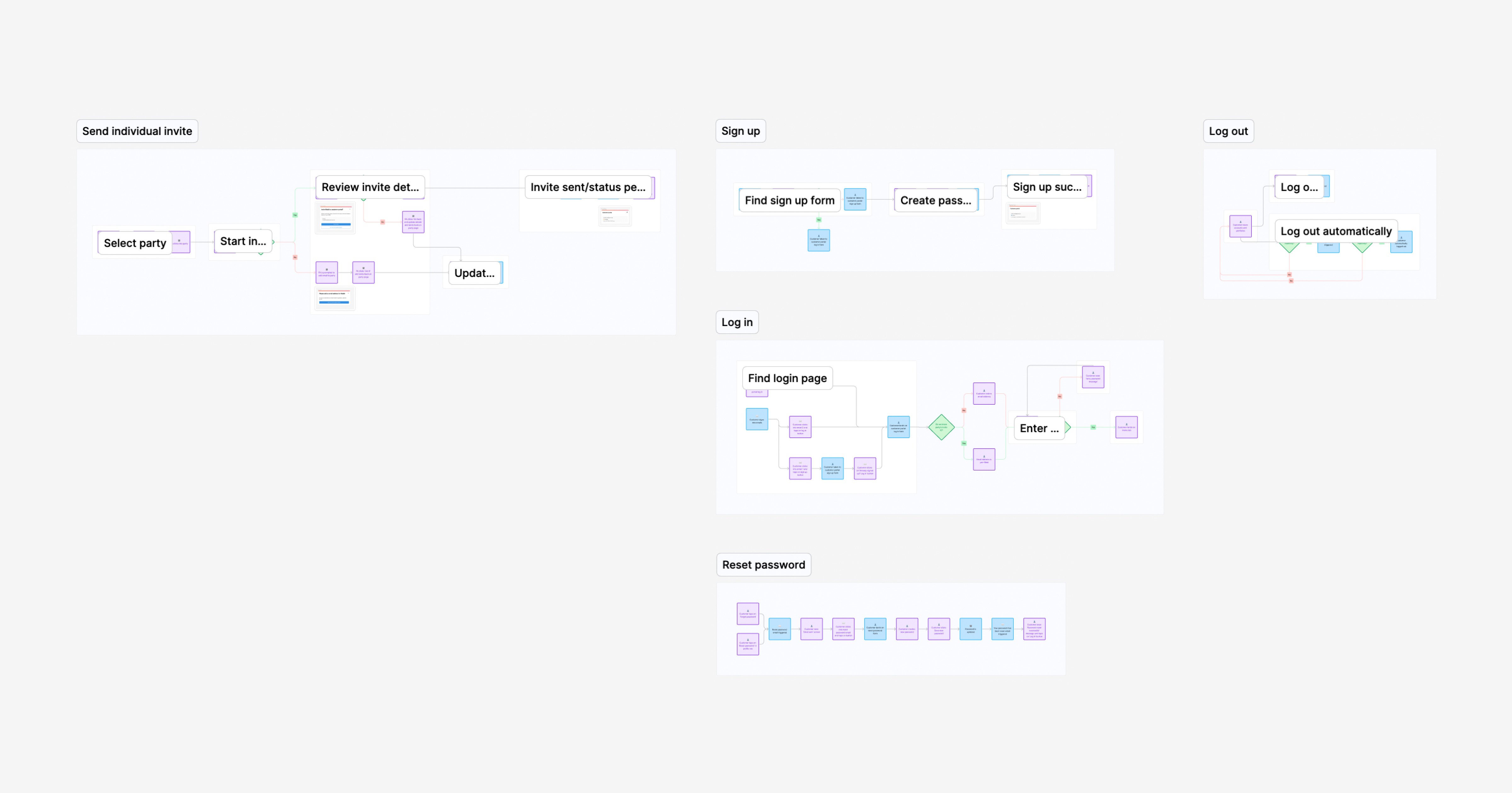
During the ideation phase, I worked closely with the WealthKernel development team, and with their support was able to ensure that the new 'send invite' feature, which allows wealth managers to invite investors to the portal, was seamlessly integrated into our existing dashboard. This required ensuring compatibility with current systems. Additionally, I consulted with them to take into account the available API fields, to determine what data could be effectively displayed within the portal interfaces. This balance between functionality and development constraints was crucial for delivering a practical and efficient solution.
Testing the MVP and prioritising enhancements
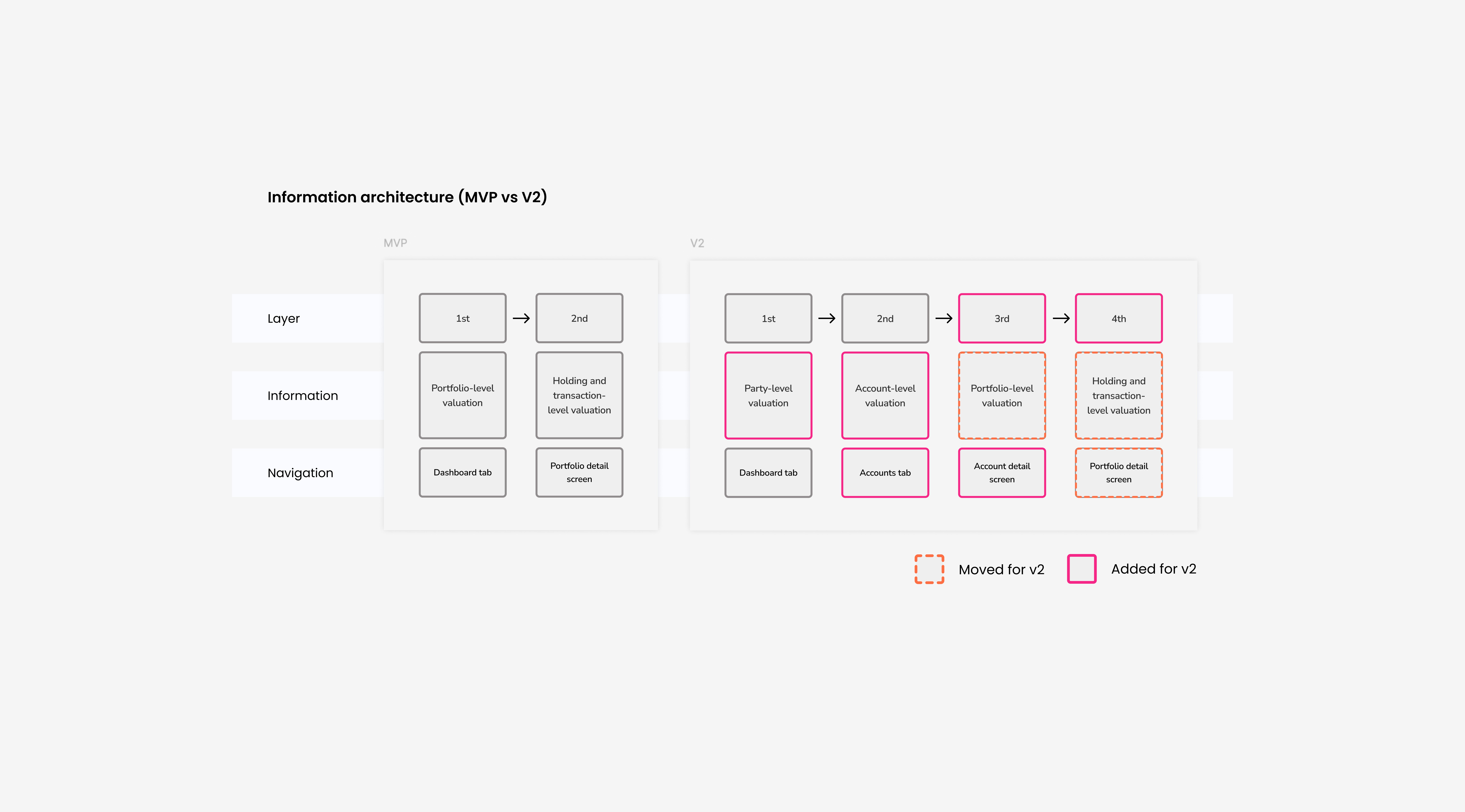
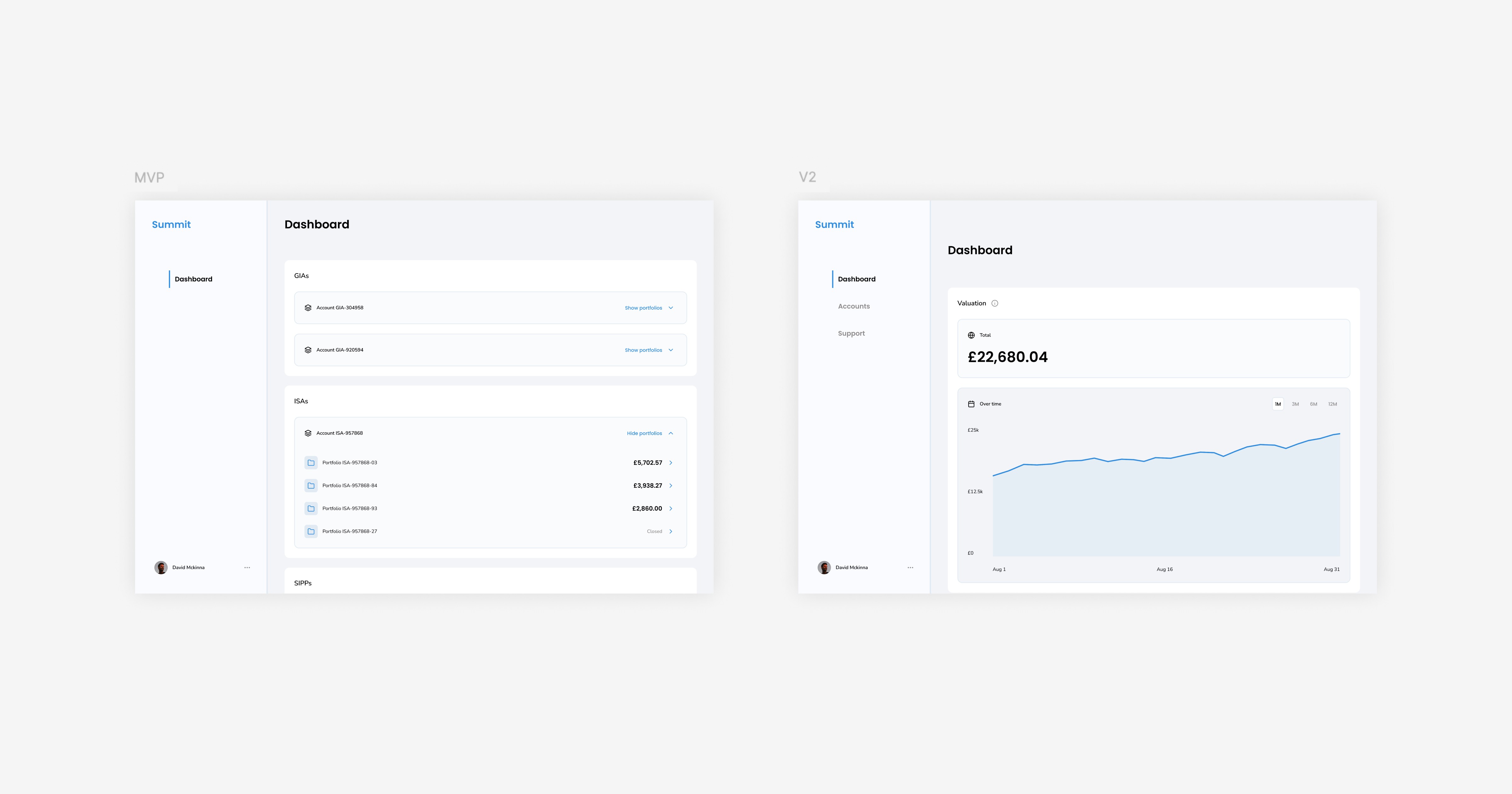
Following the initial testing of the portal, several key areas for improvement emerged: enhancing navigation with a breadcrumb trail, making interactive elements more distinguishable, and incorporating party and account-level details to enrich the user experience. I triaged these substantial changes, marking them as central to the Version 2 scoping discussions. To facilitate internal discussions with the CEO, Product and Tech teams on feature prioritisation, I created wireframes in Figjam that illustrated how Version 2 features would integrate with the existing MVP screens. These emphasised party and account-level valuations alongside the portfolio level and enabled us to refine the design effectively without spending valuable time and resources on the build.
Establishing design and development visualisation
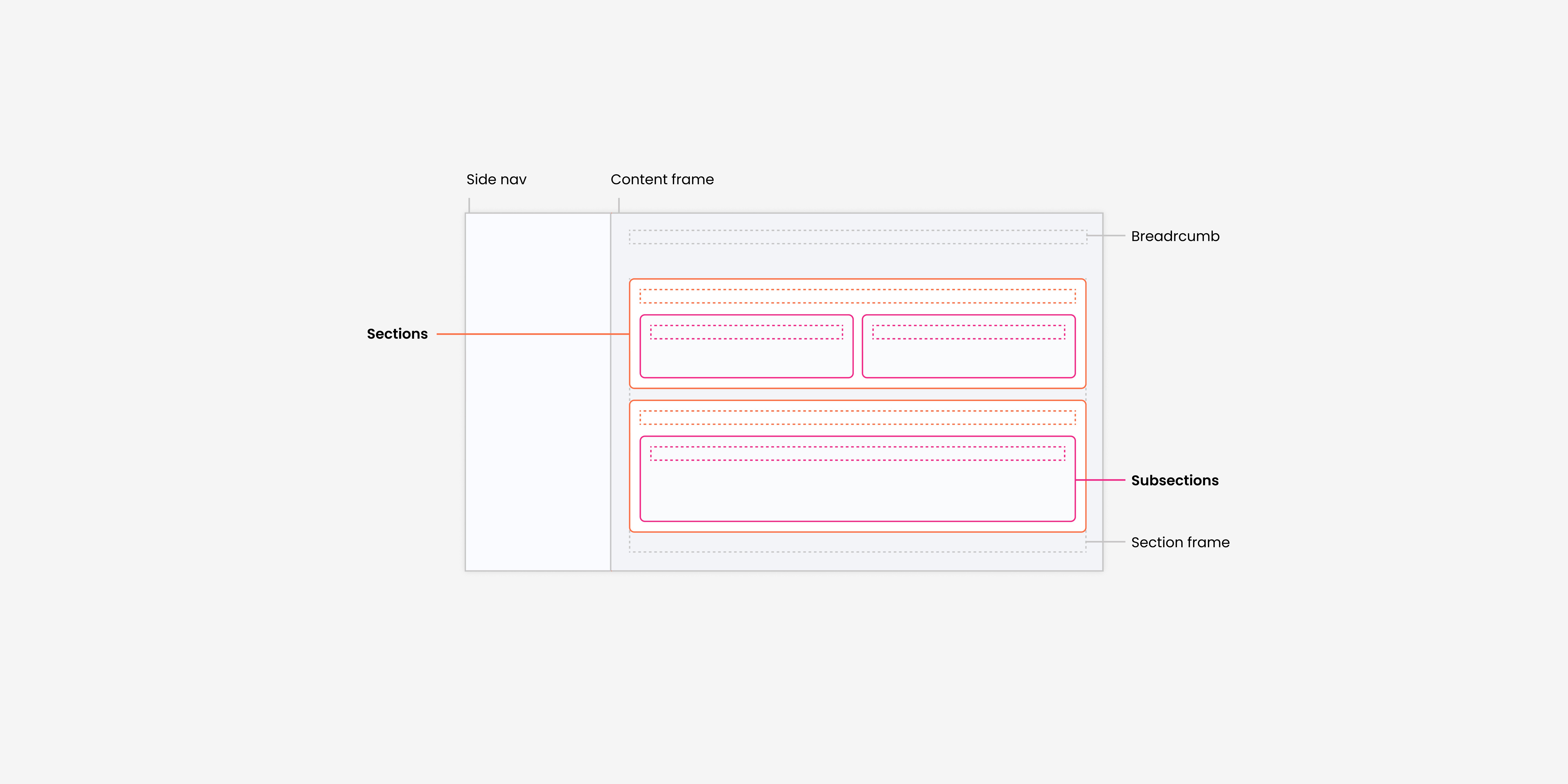
To bridge the gap between design and development, I needed to understand the existing UI kit available on Storybook. This was primarily accessible internally to developers. With the need for a clear and cohesive design and development process, I documented our design library in Figma. In a UI kit, I created and organised foundations as well as essential design components with their respective variables to ensure seamless integration into the portal. This created a shared communication channel, facilitating better alignment and collaboration between design and development teams.
Solution
Streamline access and transparent investment insights
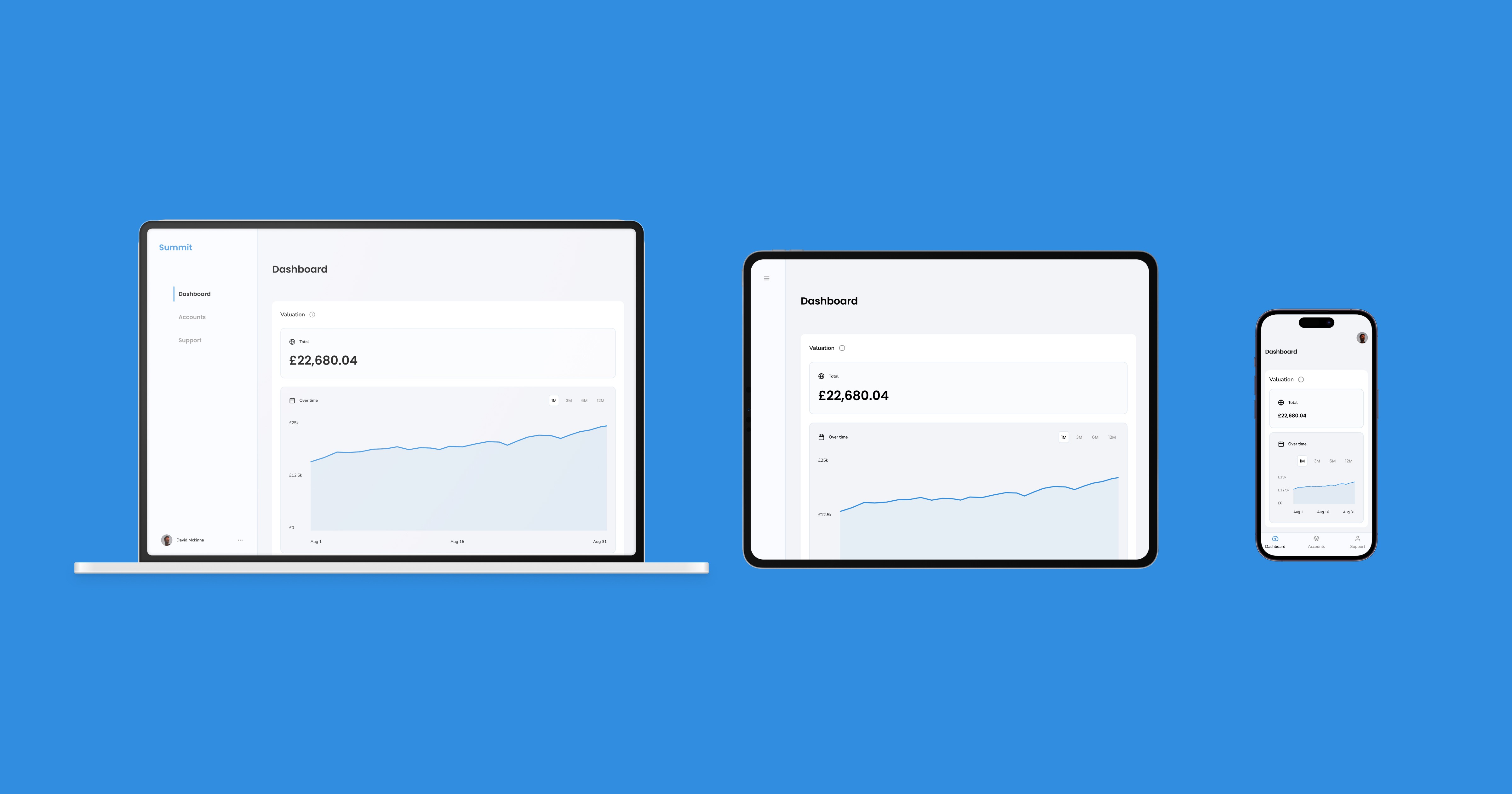
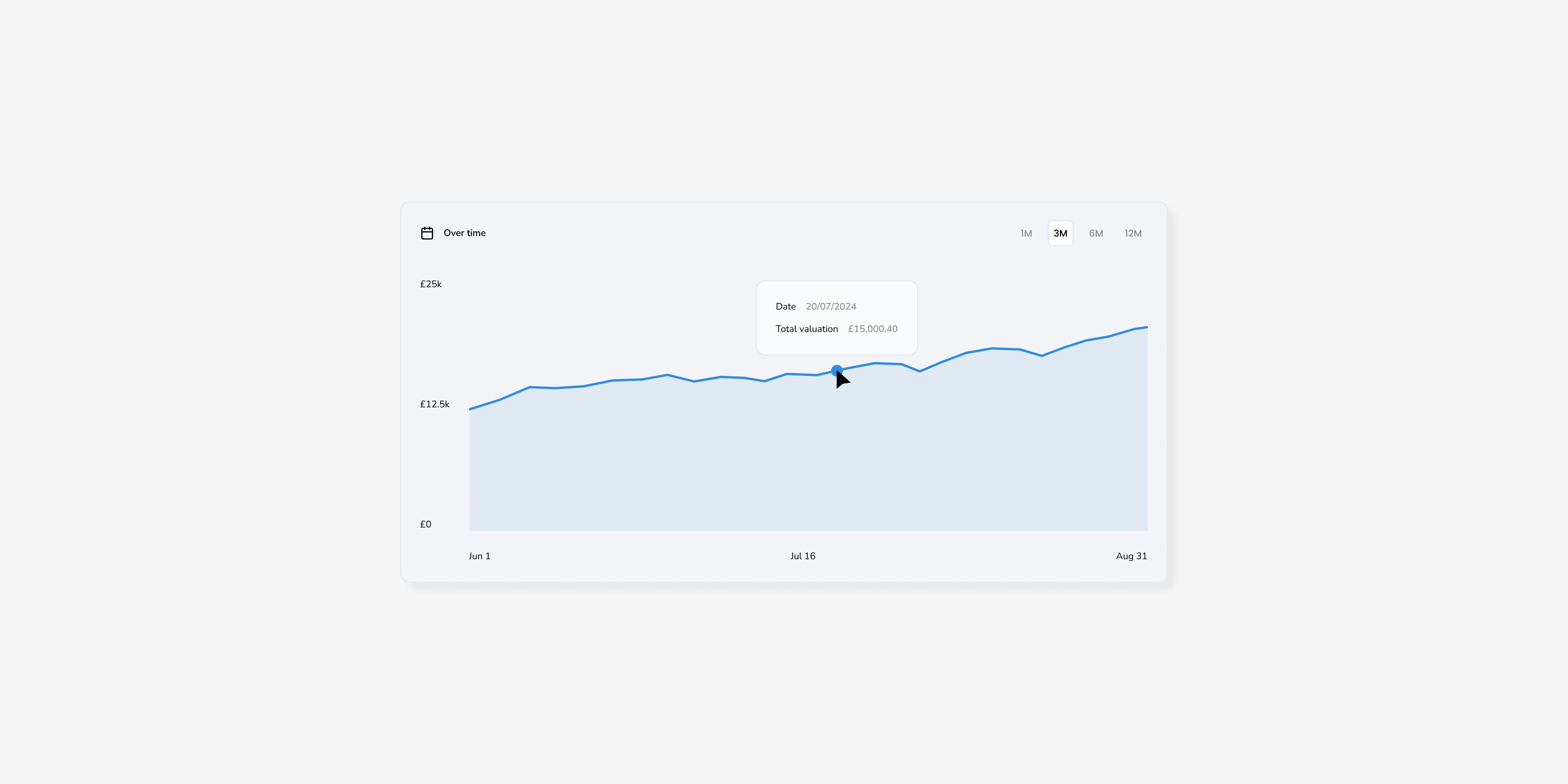
The final solution streamlined user access with a straightforward sign-up and login process. Upon entering the platform, users were presented with a clear, party-level total investment value, encompassing both current and historic data, displayed through an intuitive interactive graph. This approach provided an immediate overview of their investments, making key information easily accessible.
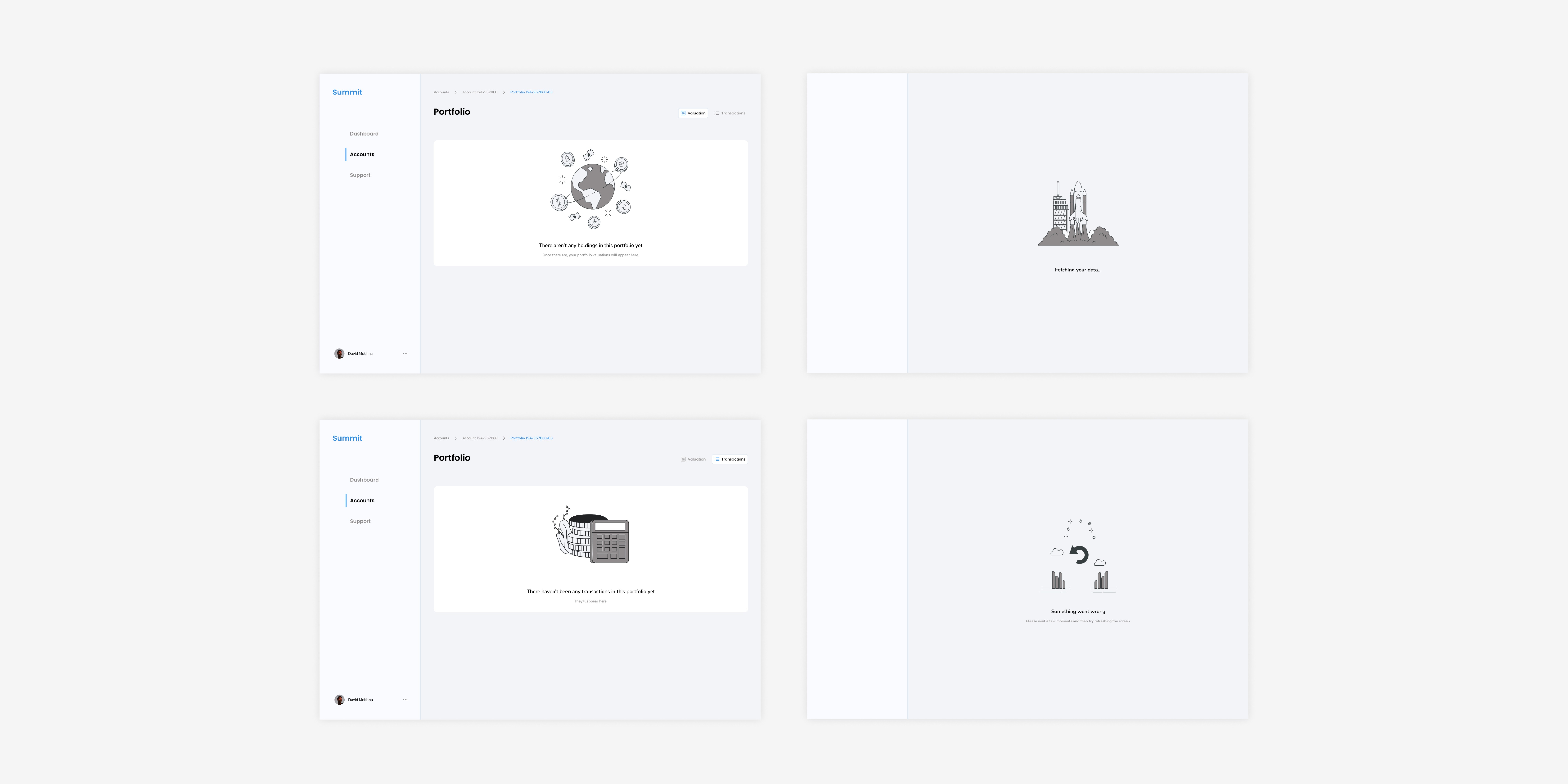
Users could then navigate to more detailed account and portfolio level valuations, offering deeper insights into their financial status. Granular holding and transaction-level data were also made available, reinforcing trust and transparency. This comprehensive yet user-friendly design ensured that users could easily access essential information while exploring detailed financial data as needed.

Next Steps
Managing the build
I am responsible for overseeing the external development team tasked with building the portal. This role involves daily stands up, design and development refinement sessions, and coordinating internal and external teams.
Mapping the wealth manager experience and write functionality
The next phase (Version 3) involves mapping out the wealth manager's side of the platform experience, with potential write functionality to support efficient management and communication needs.
The content in this case study is proprietary to WealthKernel. All rights reserved.